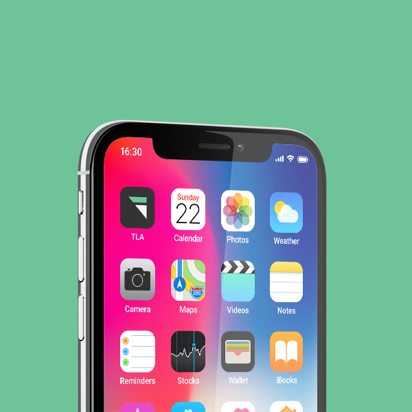
TechLatamAsia is a media startup that seeks to connect the vibrant tech worlds of LATAM and Asia through exclusive interviews, insightful articles and infographics. With all their content up and running, what they needed was a trendy new tech logo to use across their website and social media platforms.
Jeremy, the co-founder of TechLatamAsia, wanted a text-based logo with a matching symbol. The desired colour palette was a tech-forward aqua blue and white that stands out on a dark background. The idea was to have an easy-to-read logo that flowed well, and to avoid the retro pixelated design style of logos like Techcrunch and TheNextWeb.
You know you found a gem when Jolyn not only listened to our ideas, but incorporated all of it on the first try!! After which it was just some minute changes and it was all done! She was also very accommodating to questions and would definitely recommend her for any future design work (+ her photos are spectacular)
– Jeremy Yap, Co-Founder
With the chosen colour palette and design specifics in mind, I set out to create a bold and dynamic logo that would stand out in the fast world of tech.
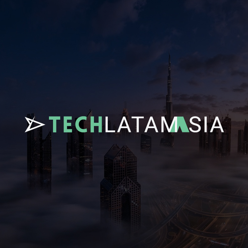
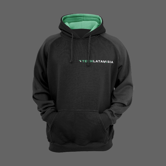
The end result is a seamless connection between LATAM and Asia with a playful twist on the M. This is accompanied by a simple but memorable triangle logo that’s positioned like wings, that complements the interconnected letter M. Wherever this logo is used, it’s guaranteed to pop, lending TechLatamAsia the visibility it wants and needs.